BRIEF DESCRIPTION OF THE COURSE
Study Materials (Teaching Materials)
- Numbers and graphs
- Constructions and pronunciation of past forms
Expected Final Capability
- Students are able to communicate data/numbers on graphs
- Able to use past tense in describing graphs
Forms/Methods/Learning Strategies
- Cooperative learning
- Discussion
- Reflections
Assessment Criteria (Indicators)
- Accuracy of explanation of data and numbers in graphs
- Accuracy in selecting graphic description sentences
Unit One
Numbers and graphs
Introduction to Bar Charts:
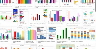
A bar chart is a graphical representation of data that uses rectangular bars to display and compare the values of different categories or groups. In a bar chart, the length or height of each bar is proportional to the value it represents.
Bar charts are typically used when you want to:
Compare Categories: Bar charts are excellent for visualizing and comparing the quantities or frequencies of different categories or groups. For example, comparing sales figures for different products, or the performance of different teams.
Show Trends over Time: Bar charts can be used to display data over time, especially when the time intervals are discrete (e.g., months, years).
Display Categorical Data: They are ideal for displaying data that falls into distinct categories, such as types of fruits, countries, or job titles.
Highlight Differences: Bar charts make it easy to see disparities between different categories. This can be useful for identifying areas that may need attention or improvement.
Present Non-Continuous Data: Unlike line graphs, which are suitable for continuous data, bar charts work well for data that can be categorized into distinct groups.
Visualize Rankings: Bar charts are effective in showing rankings or order of items in terms of their values. For instance, which products are the best-selling or which countries have the highest population.
Compare Sub-Groups within Categories: Grouped bar charts allow you to compare sub-groups within each category. For example, comparing the performance of different departments within a company.
Remember, the choice of chart depends on the nature of the data and the story you want to convey. A bar chart is a powerful tool, but it's important to select the right type of chart for your specific dataset and message.


